FRONT COVER
 When designing my front cover I decided I wanted one strong male character to be the main focus of my magazine. This is because on most of the style models I looked at for indie magazines this was always the case. I have included all the codes and conventions that I had found when researching. I gave my magazine a quirky title and flipped the Z the wrong way to make it even more individual and so that my magazine had it's own brand image.
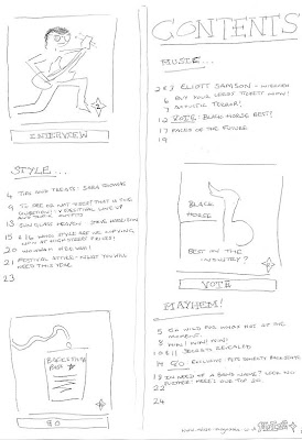
CONTENTS PAGE
 When designing my contents page i decided to make it very simplistic as the most of the style models I looked at were very plain but still included some of the quirky conventions that were on the front covers. I decided to use 3 different photos that linked to the front cover so that it tied in with the stories printed.
DOUBLE PAGE SPREAD
 When designing my double page spread I decided I wanted the image to stretch over both pages, so that one of my pages didn't just include background I decided that I would take a number of pictures in one place and merge them all together using photoshop. This meant that both pages were covered with the artist. I've also included the codes and conventions that I found on the double page spreads that I researched.


No comments:
Post a Comment