Thursday, 13 May 2010
 CONTENTS FINAL

Technical Guide
Front Cover:
When producing my front cover I had to duplicate the background layer to allow the title of my magazine to sit behind my artists head. I found an appropriate font to match with the style of magazine using the internet and setting the font up into photo shop. I created the mist effect behind the sub articles being using the shape tool and turning the opacity down to 60% and feathering the edges with a rubber tool. This meant my text was easier to read. I edited the main image by adjusting it's contrast, brightness and saturation. I also increased the warmth of the light in the photograph.
Contents Page:
When producing my front cover my main aim was to leave less space. I placed the sub article photographs down the side of the page and used the shape tool to create a border. I edited the "Pete Doherty pass" image by turning the saturation right down to create a black and white image. I edited both the main article and vote article image by increasing the saturation, contrast and brightness. I used a more simple font for the sub articles as this was shown throughout the style models I researched.
Double Page Spread:
When producing my double page spread I had many ideas about using one image on top of the other to create a main image. The main photograph consists of three seperate photographs. To do this I placed my first photograph onto the canvas in photoshop. I then placed the next image over the top and erased this layer so that the part of the layer underneath I wanted showing would appear. I again did this with the final image layer which left me with one strong image which I then flatterened all the layers together. I again used the mist effect to allow my text to be easier to read. I again did this by using the shape tool and turning the opacity down to 60% and feathering the edges with a rubber tool. The same shape appears behind the quote from the article and the heading.
Rough Drafts


Audience Feedback
Person 1
My first impressions of your cover, I enjoy the image, it’s a strong image you have used, a good photo. I believe this is a likely image you’d expect to find on a music magazine.
However, it may be an idea to retake your photo. Despite it being very good, there are small things you could touch up on to gain that all important perfect image.
Apart from that good job!
There is a clear house style which is echoed through your work through the bright, dramatic colour scheme boasting shades of red and yellow. This makes it clear to anyone browsing a shop that it is an indie magazine, and could be open to boys and girls. Although I think the double page spread colours need a little adjusting!
The main title ‘Maize’ I believe could be centred and made bigger so that it spans across the whole of the cover. This would make it appear more realistic.
I think you could scrap the star at the top right corner.
Overall great magazine!
Person 2
Double page spread
I really like the image used it looks like a real magazine photo. Forest back ground makes it look like a photo shoot. The title goes over 2 pages so it looks like a double page spread and it stands out a lot because it is in bold white text on a dark background so it is easily readable and the audience know what the article is about. The layout of the text looks really well presented and again realistic!
Lauren Gray, this is absolutely excellent.
Person 3
The image is a very strong image
You could maybe change the colour of the title as it looks very dangerous!
The genre of the magazine stands out very well
Once again the image is really good, he is a good match for your indie style
I like how you've included page number and the name of the magazine and website
The image looks very professional, Excellent!
The style of the heading relates well with the style, its really goooood
TEACHER FEEDBACK
Front Cover:
Like:
Branding (style, tone, colour scheme)
"PLUS" section
Could Improve:
Make magazine title stand out
Red text is hard to read - outline?
Contents:
Like:
Sections (Music, Style, Mayhem)
Font and branding
Could Improve:
Lots of empty space, boxes round items
Change contents font
Double Page Spread:
Like:
BRILLIANT picture
Branding in corner
Could Improve:
Colours
Put all the text into three columns on one page
Photo Planning and Locations


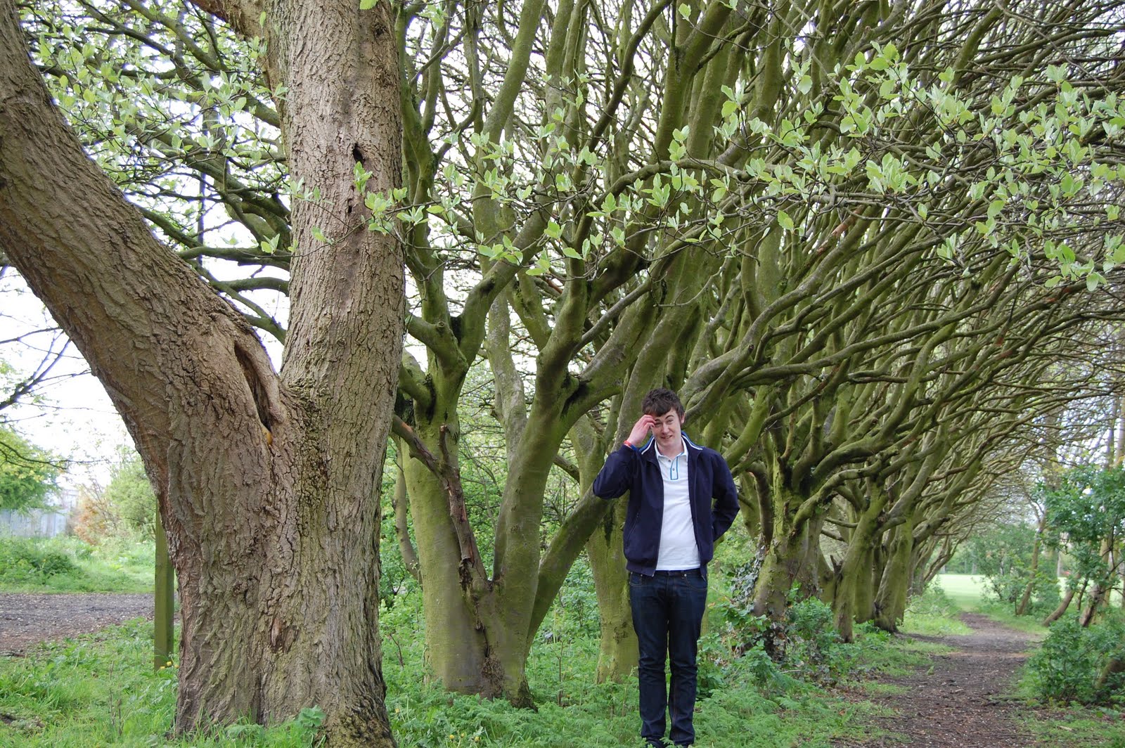
I chose this location because I felt it would fit in well with my genre (Indie). This is because it's a very relaxed and peaceful setting. Also I liked how the main focus is the big tree therefore it would allow me to stagger my character up the path as the trees get smaller the further they are away.
ORIGINAL PHOTOGRAPHS


.JPG)


.JPG)
.JPG)
.JPG)
Audience Research
Cross the Boxes [x] (you may cross more than one if it applies)
1. Are you…
Female [ ]
Male [ ]
2. How old are you?
13 – 15 [ ]
16 – 18 [ ]
Over 18 [ ]
3. Do you read magazines often?
Daily [ ]
Weekly [ ]
Monthly [ ]
Yearly [ ]
4. List four music magazines you read (or as many as you can)…
1.
2.
3.
4.
5. What type of imagery attracts you to a music magazine?
Your favourite singer [ ]
Your favourite band [ ]
A number of music stars [ ]
A random image that reminds you of the genre [ ]
6. What sort of things catch your eye when looking for a music magazine?
Images [ ]
Titles [ ]
Main Story [ ]
Inside Stories [ ]
Celebrities/People featured in the Magazine [ ]
7. What price range do your music magazine you buy lie in…
99p - £2 [ ]
£2.01 - £3 [ ]
£3.01 - £4 [ ]
£4.01 - £5 [ ]
Over £5 [ ]
8. Do the music magazines you read contain free gifts/posters?
Yes [ ]
No [ ]
Sometimes [ ]
RESULTS

Most of the people I found that read music magazines were male. Each person was aged between 16 - 18. Most of the people read their music magazines weekly. NME and Paste are the most read magazine (genre – Indie/Rock). Most people are attracted by the magazine because of who is in them. The thing that first catches their eye when looking for a music magazine is the imagery. Most people pay between £2.01 - £3 for their magazines. Most of the magazines people buy sometimes have free gifts or posters.
Gender
 How old are you?
 Do you read magazines often?
 List four music magazines you read the most
 What type of imagery attracts you to a music magazine?

 Do the music magazines you read contain free gifts/posters?
Initial Sketches

CONTENTS PAGE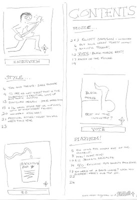
DOUBLE PAGE SPREAD

